

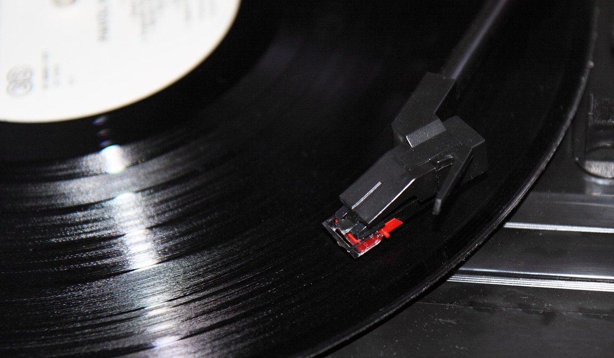
There is a particular pleasure in sliding a record from its sleeve, the cardboard warm in your hands, the smell of paper and ink rising as the disc emerges. Long before the stylus finds the groove, the sleeve has already begun to shape what you are about to hear. It sets a mood, promises a world, and gives you something to look at while the music unfolds. For collectors, the sleeve is never just packaging. It is the first movement of the album.
The sleeve as the first listen
A record cover is a piece of design that has to work at several distances. From across a room, it needs a strong silhouette and a readable title. In your hands, it rewards closer inspection: the weight of the board, the finish, the way type sits against image. A sleeve can be minimal or maximal, but it must feel deliberate. When it works, you hear the music differently because you have already been given a frame for it.
Think of the difference between a matte, uncoated sleeve and a high-gloss laminate. The first feels intimate, almost like a paperback book. The second catches the light and throws it back, making the cover feel like an object on display. Neither is better. But each changes how you approach the record. The physical surface is part of the invitation.
Typography: the quiet voice of an album
Type does more than name the artist and the album. It carries tone. A geometric sans-serif can feel modern, cool, and precise. A hand-drawn script can feel personal, ragged, or romantic. A heavy serif can feel authoritative, like a classic novel. The best sleeves use type as rhythm: the size of the title against the small print, the spacing between letters, the hierarchy that guides your eye from cover to spine to inner sleeve.
Pay attention to the details next time you pull a record out. They are often the difference between a sleeve you glance at and one you keep returning to.
- Spine text: A clear, well-spaced spine makes a shelf readable and turns your collection into a library you can browse.
- Track listing: Placing song titles on the back or inner sleeve encourages you to read them as a sequence, not just a menu.
- Inner sleeve lyrics: When lyrics are printed on a plain paper inner, the act of listening becomes closer to reading poetry.
A sleeve with beautiful typography invites you to stay with the record. You read while side one plays. You flip the inner sleeve over. You notice a credit you had missed. That is design doing its quiet work.
Photography, colour and the mood of a record
Photography sets the emotional weather of an album. A grainy black-and-white portrait can feel raw and intimate. A saturated landscape can feel expansive, almost cinematic. A blurred street scene can suggest late-night movement. Art direction matters as much as the image itself: the crop, the focus, the grain, the amount of empty space around the subject.
Printing brings its own language. A duotone can make a photograph feel like a memory. A four-colour process can produce rich, naturalistic detail. A single spot colour can be bold and graphic, especially when it is printed on uncoated board so the ink sits softly on the surface. Colour is not decoration. It is atmosphere. A warm terracotta can make a folk record feel sunlit; a cold cyan can make an electronic record feel like a city at dawn.
Printing techniques you can feel
The best sleeves are tactile. They use the physical properties of card, ink, and paper to slow you down. Embossing raises a logo or a title above the surface. Debossing presses it into the board. Foil blocking adds a metallic flash that catches the light. Die-cuts create windows, revealing an image beneath. Gatefolds open like a book, turning a cover into a spread.
These techniques are not gimmicks when they serve the music. They create a small ceremony. You notice the weight. You run a thumb across the raised letters. You open the gatefold and find a lyric sheet or a photograph you were not expecting.
- Embossed lettering: Gives a title a sculptural presence, especially on a matte finish.
- Die-cut windows: Can reveal an inner image or a coloured vinyl disc, making the object feel layered.
- Textured board: Rough uncoated stock absorbs ink differently from smooth coated stock, changing the mood of every image.
Wear and tear becomes part of the object too. A little ring wear, a softened corner, a seam split along the top edge: these are not flaws to be mourned. They are evidence of use, of mornings and evenings spent with the same record.
Listening as a physical ritual
A sleeve shapes attention. You cannot skip a track with a glance. You have to turn the record over, which means the side break becomes a pause, a breath, a chance to look again at the cover. The music is divided into movements, and the sleeve is the programme. That is why a well-designed cover can make an album feel like a complete world rather than a collection of songs.
To keep that world intact, treat the sleeve as you would treat the record. Store records vertically, never stacked, so the boards do not warp. Use outer sleeves to protect the corners from shelf wear. Replace tight paper inners with anti-static, poly-lined sleeves, which are kinder to the vinyl and easier to slide in and out. Avoid PVC sleeves for long-term storage, as they can off-gas and damage the cover. Keep everything out of direct sunlight, which fades ink and warps card.
When you buy a record, you are not just buying audio. You are buying a designed object, made by people who cared about type, image, paper, and ink. The sleeve is the handshake before the music speaks. Give it your attention, and it will keep shaping the way you listen for years.


Coding is used in almost all aspects of life and work now, be it directly or indirectly. It’s not just for companies in the tech sector. “An increasing number of businesses rely on computer code,
Coding is used in almost all aspects of life and work now, be it directly or indirectly. It’s not just for companies in the tech sector. “An increasing number of businesses rely on computer code,
Coding is used in almost all aspects of life and work now, be it directly or indirectly. It’s not just for companies in the tech sector. “An increasing number of businesses rely on computer code,